ILLUSTRATION
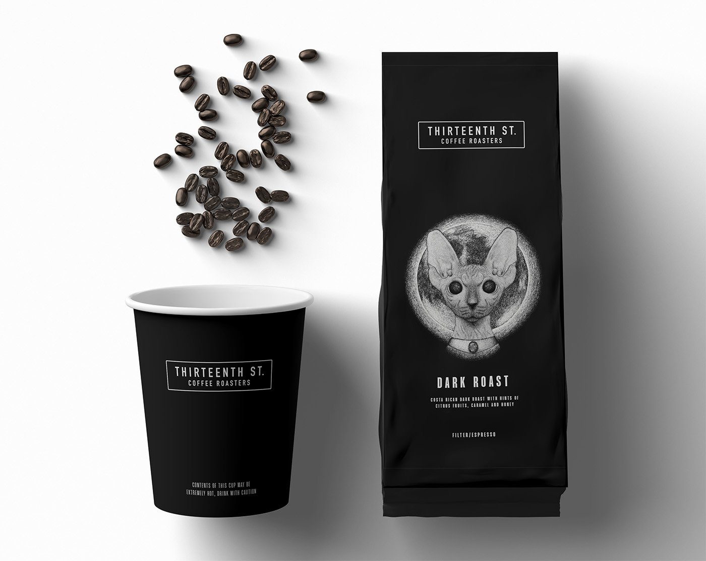
The strong visuals compliments the brands unique eeriness as a stark differentiation from other coffee brands. A pure black and white color scheme creates visually striking imagery by using the highest contrast possible. To imitate the appearance of shading, I used varied concentrations of dashes—giving a halftone effect.


